By: Resonant
Did you know you can customise your Salesforce user interface to align with your brand persona and enhance the user experience for your team? While Salesforce is a powerful CRM tool, its effectiveness hinges on proper adoption. Many sales reps new to Salesforce find the interface challenging to navigate, indicating the business may not have explored optimisation options, crucial for successful adaptation. In this blog post, we’ll share tips for simplifying and customising Salesforce page layouts to better suit your team’s needs and to be used to its fullest potential.
It is all about three things for users: simplicity, consistency and user friendliness.
Understand users and needs for successful adoption
Begin by understanding your team’s needs from the Salesforce platform before you begin to change the user interface. You can begin to do this by asking two simple questions:
- What business processes need to be completed daily?
- What data or filters do they need to access daily to do their job efficiently?
Understanding this will help you identify which apps, records, fields, features and page layouts are irrelevant. Simple is better.
Key tips to improve your Salesforce UI for better adoption:
Visual aids to help users understand their data
Data is key when running an efficient business, however understanding data in Salesforce can be challenging if no visual aids are utilised. Salesforce tools are available to generate data in an easy to understand way – some of these include:
- Report charts
- List views
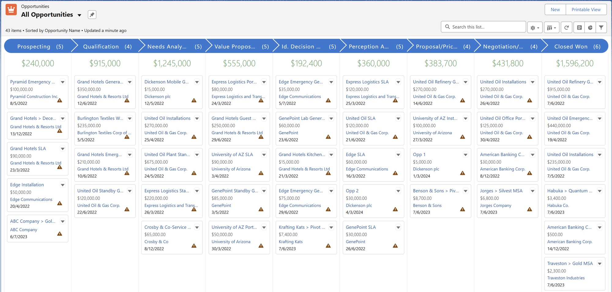
- Kanban views
Example of Kanban views for Opportunities and custom objects list views: Opportunities in Kanban view.
Simplify Salesforce Navigation tabs
A cluttered interface can frustrate users and lead to confusion about where to find the needed information. To maximise your Salesforce users’ experience, focus on the tabs displayed at the top of their screens. Identify relevant tabs based on their job responsibilities and ensure they are easily accessible. By hiding unnecessary tabs, you can declutter the interface, making it more user-friendly and helping your team make the most of Salesforce.
‘More’ tab dropdown options:

If you want to add more tabs than the ones that fit on the navigation bar – these get added as a drop down on the “More” tab. It’s worth noting however, that it is the apps that control the objects/tabs the users see here, so you can create and assign apps for different groups/types of users.
Tip: Consider the tabs required and the hierarchy of importance/access frequency. You can then order your tabs accordingly so that less frequent tabs are more likely to fall into the ‘More’ dropdown.
Additionally, if you need to use a larger number of objects, consider setting up a Console app. It will keep the navigation bar cleaner and allow you to have multiple records open on the same page, instead of having multiple tabs. Read more about this here.
Console App view:

Furthermore, the navigation bar in Lightning experience offers far more than just page access. It’s packed with shortcuts that allow you to quickly create records and navigate directly to specific pages, no matter where you are in the system. Notice the arrow drop down icon next to many of your items? Click on it, and you’ll find a convenient menu that provides a range of useful options, like recent lists or records, for the tasks you’re currently working on.
Navigation bar shortcuts:

Homepage: List views and Report charts
List views are useful for Salesforce admins, allowing them to create custom views on the homepage tailored to users’ needs. This customisation reduces training time and enhances efficiency.Dynamic views automatically update to display records based on filters like “My Records” or “My Team’s Records,” ensuring users have access to relevant information. By prominently featuring key list views, admins help users stay organised and keep important deals, cases, and prospects top of mind.
You can also enrich the homepage with Report Charts that show trends by department. For example, a sales rep may have visibility for how they are tracking for the month, and what they need to do to hit KPIs.
Resonant Cloud Demonstration Dashboard:

On record pages, dynamically filtered report charts can be added as well. For instance, the account page can show all related cases, grouped by type or status. These features provide valuable insights, helping teams grasp both the big picture and the finer details of customer interactions.
Best performing platforms on Campaign record:

Customise the layout structure of standard and custom objects
One of the standout features of Salesforce is its ability to be customised to fit the unique needs of your business. However, this flexibility can be a double-edged sword. Maintaining consistency is crucial, as it ensures that your users have a seamless experience, no matter which object they are working with.
Below are some ways in which you can ensure customisation and consistency:
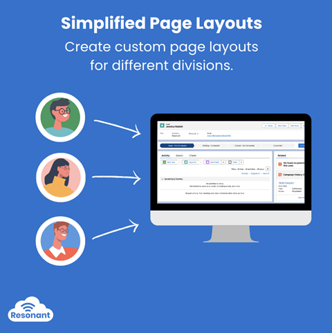
- Simplify page layouts:
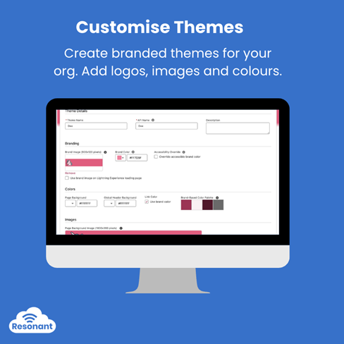
- Customise themes: Learn more here
- Use Dynamic fields to show the most important/relevant fields first (or shown only when needed e.g. when the status is a certain value).
- Use the ‘comfy’ display density setting to adjust layout styles.
Comfy Setting:

Better status visualisation with Path components
The Path feature in Salesforce is a powerful tool that enhances visibility and transparency within an organisation. It allows users to track the status of Leads, Opportunities, Cases, Campaigns, and custom objects at a glance, ensuring everyone stays aligned and no details are overlooked.
By creating paths, you can guide users through business processes, such as turning a new lead into a closed deal. Each step can highlight key fields and provide tailored guidance to boost productivity and data completeness.
Getting Started with Paths:
-
- Enable Path: Start by enabling the feature in Setup.
- Create Paths: Develop a unique path for each combination of object, picklist, and record type. Celebrate achievements with virtual confetti when reps reach the designated path steps.
Closed Won Confetti Celebration: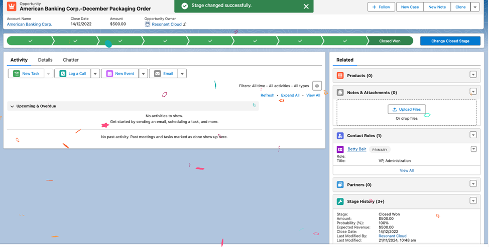
- Configure Last Path Step: The order of path steps aligns with the picklist values, with the last step typically representing a closed stage. You can modify the picklist values applied when records transition to the final step.
Considerations: Before creating paths, be sure to review guidelines related to different objects and features to maximise their effectiveness.
Read more on how to create Paths
Dynamic UI – Record Pages
When it comes to enhancing user interface, dynamic UI is the name of the game.
Salesforce allows you to show fields, components, buttons and more based on set filters. Filters can be username, user role, field values etc.
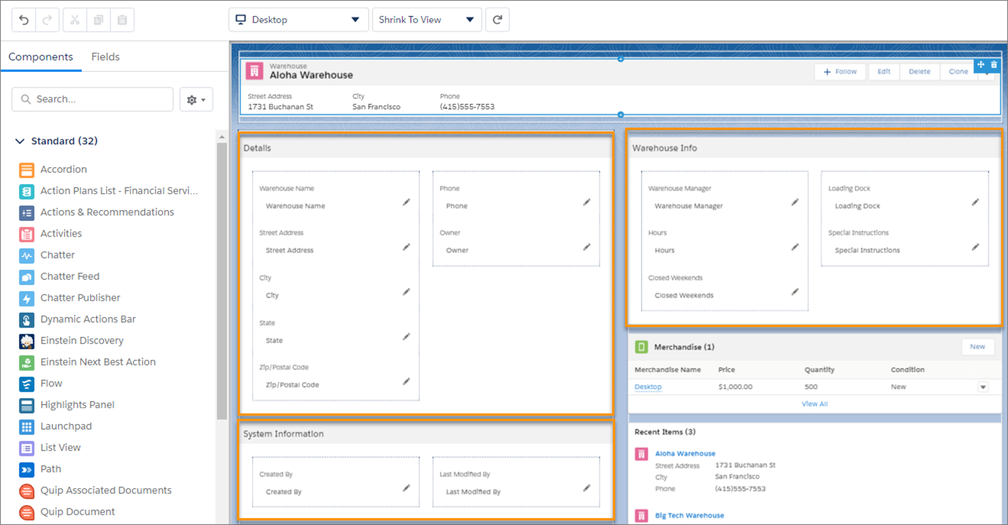
Dynamic forms – This allows you to break up your record detail and is a big change to how users interact with record pages.
Having too many fields on your page layout turns the Record Detail component into an inflexible block. With Dynamic Forms, you can move these fields and sections into individual components within the Lightning App Builder, allowing for better customisation. You can arrange fields across multiple columns and tabs and control their visibility based on record data, user details, and device type, ensuring users see only what they need.
Dynamic Forms simplify layout management by allowing you to manage fields and sections directly in the Lightning App Builder, without the page layout editor.
As shown below, reduce the need for multiple page layouts and record types using component visibility rules. Plus, streamline Lightning page assignments with a single assignment model, eliminating the need for both a Lightning page and page layout.
Component visibility rules:
Source: Salesforce
Dynamic Forms offers:
- Custom Field Placement: Arrange fields and sections freely and align them with blank spaces.
- Dynamic Visibility: Set rules to show or hide fields and sections based on context.
- Easier Management: Manage fields directly in the Lightning App Builder, reducing reliance on the page layout editor and minimising the number of layouts needed.
To start using Dynamic Forms, either create a new Lightning page and add Field components or open an existing record page and use the migration wizard to update it.
Read more here
Dynamic related lists – Dynamic related lists enhance flexibility and control on your record pages. Instead of using the page layout editor, you can customise and filter related lists directly in the Lightning App Builder. By setting up multiple dynamic related lists with different filters for the same object, users can easily access the most relevant records. You can create these lists for both custom objects and Salesforce record home objects enabled for LWC, though they are currently supported on desktop only. E.g. It shows closed won opportunity related list on account page rather than showing all opportunities.
Dynamic related lists:
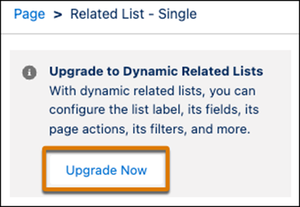
Find out the exact steps to create a dynamic related list here
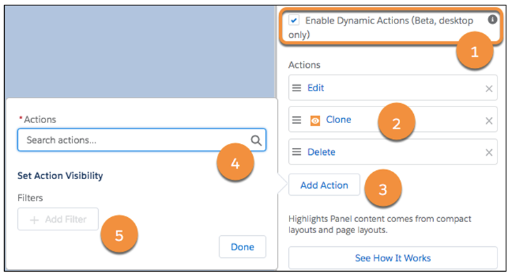
Dynamic Actions – With custom objects, you can utilise the Lightning App Builder to select which actions appear in the Highlights Panel of the record page, rather than relying on the page layout editor. You can also control the visibility of each action based on your specified criteria.
For example;. show button depending on stage of the sales process in an Opportunity page.
Dynamic actions:
Source: Salesforce
Learn more here.
Dynamic highlights panel – highlights panel helps users see key components of the record without scrolling down. Adding filters to this enhances the UI even more.
Dynamic Highlights:

All of the above are related to just record pages and how users interact with the record through its lifecycle.
We sincerely hope you find this information useful! If you need any assistance, please complete the form below, and one of our consultants will contact you shortly.
Need a hand?
Our team of experts are ready to help you with all your Salesforce, MCAE and Marketing needs. Send us a message by filling out the form below.
